Trellis Graphs
Trellis (格子) グラフはlattice パッケージで作成できる。
...ってTrellisって何やねん、と思ったらこちらを参照 <S-PLUS mini course 第13回>。感謝。1つのパネルに複数のグラフをかいたものがtrellisグラフ。こういうときはY軸の単位をそろえるのは結構面倒なんだが、それを簡単にやってくれるのがlattice ということらしい。
trellisグラフは複数の変数、条件間の関連性を表現できる。いろいろなタイプのプロットがある。
フォーマット:
graph_type(formula, data=)
graph_type は以下のなかから選ぶ。formulaで変数を指定する。
~x|A は数値変数xをAという因子にしたがって表現するということ。y~x | A*B であればA要因とB要因の各水準の組み合わせで数値変数xとyの関係を表現する。
| graph_type | description | formula examples |
| barchart | bar chart | x~A or A~x |
| bwplot | boxplot | x~A or A~x |
| cloud | 3D scatterplot | z~x*y|A |
| contourplot | 3D contour plot | z~x*y |
| densityplot | kernal density plot | ~x|A*B |
| dotplot | dotplot | ~x|A |
| histogram | histogram | ~x |
| levelplot | 3D level plot | z~y*x |
| parallel | parallel coordinates plot | dataframe |
| splom | scatterplot matrix | dataframe |
| stripplot | strip plots | A~x or x~A |
| xyplot | scatterplot | y~x|A |
| wireframe | 3D wireframe graph | z~y*x |
以下使用例
library(lattice)
dat <- read.delim("http://eau.uijin.com/about/datasets/pitching.dat")
dat2 <- subset(dat, G>median(dat$G)) # 投手データ、中央値 (278) 試合超の登板
attach(dat2)
# 因子変数を作っておく
erac <- cut(ERA, breaks=c(-Inf, quantile(ERA)[2:4], Inf), include.lowest=T, labels=c("ll", "l", "h", "hh")) # 防御率を四分位数で4分割
yearc <- cut(Years, breaks=c(-Inf, quantile(Years)[2:4], Inf), include.lowest=T, labels=c("mm", "m", "lg", "llg")) # 年数を四分位数で4分割
# 勝率
wp <- W/(W+L)
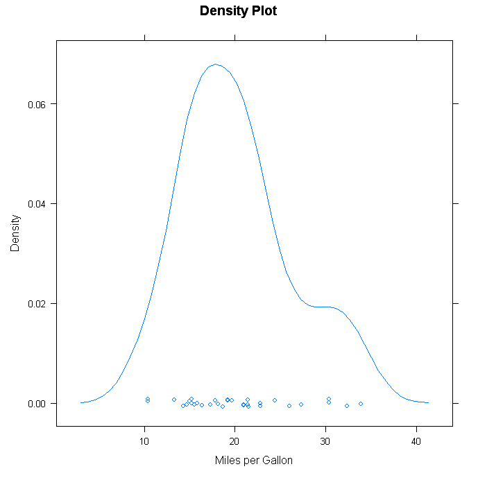
# カーネル密度プロット
densityplot(~wp, main="Density Plot", xlab="勝率")
main="Density Plot",
xlab="勝利")
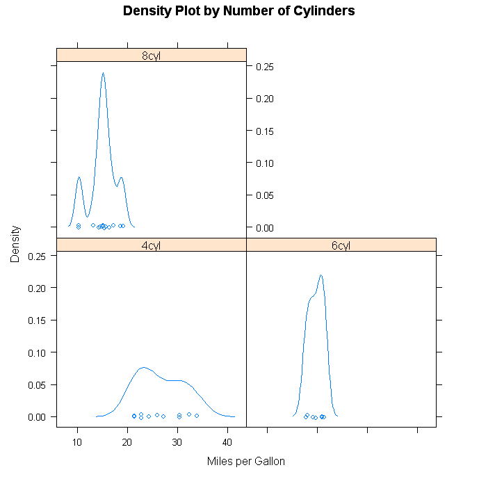
# 因子ごとのカーネル密度プロット。防御率のカテゴリーごとの勝率
densityplot(~wp|erac, main="防御率ごとの勝率", xlab="勝率")
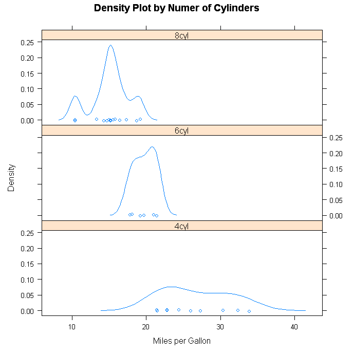
# 上と同じものを別レイアウトで
densityplot(~wp|erac, layout=c(1,4))
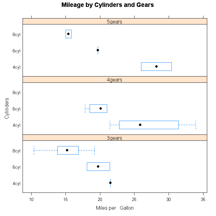
# 防御率、年数の組み合わせの勝率箱ヒゲ図
bwplot(yearc~wp|erac, ylab="年数", xlab="防御率", main="防御率 x 年数ごとの勝率", layout=c(1,4))
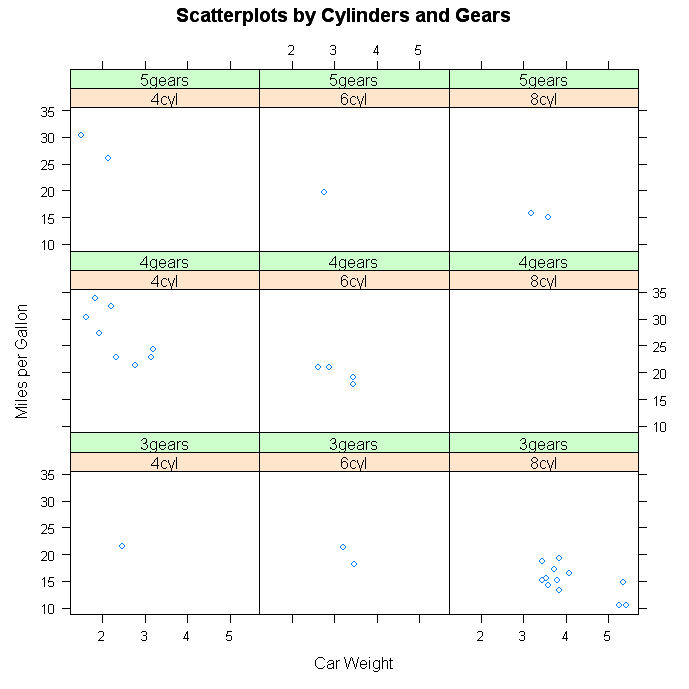
# 防御率、年数の組み合わせの被本塁打と奪三振散布図
xyplot(HR~SO|erac*yearc, main="防御率と年数ごとの散布図", xlab="奪三振", ylab="被本塁打")
# 防御率ごとの被本塁打、奪三振、与四球の3次元散布図
cloud(HR~SO*BB|erac, main="防御率ごとの3次元散布図")
# 2つの要因の組み合わせのドットプロット
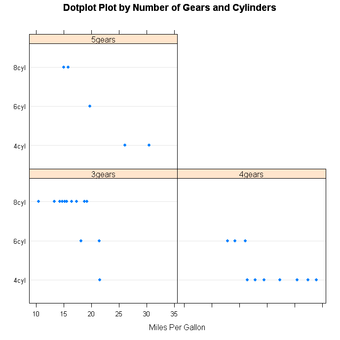
dotplot(erac~wp|yearc, main="防御率ごとの勝率", xlab="勝率")
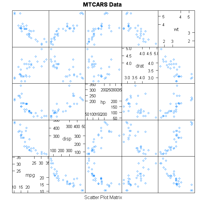
# 散布図行列
splom(dat2[c("W", "H", "HR", "BB", "SO", "ERA")], main="勝利数、被安打、被本塁打、与四球、奪三振、防御率")

click to view
Note, as in graph 1, that you specifying a conditioning variable is optional. The difference between graphs 2 & 3 is the use of the layout option to contol the placement of panels.
Customizing Trellis Graphs
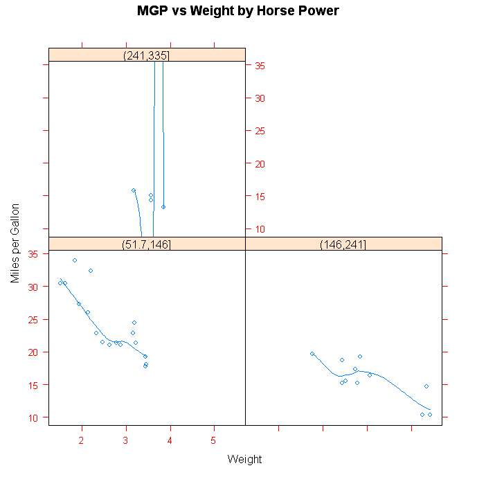
Unlike other R graphs, the trellis graphs described here are not effected by many of the options set in the par( ) function. To view the options that can be changed, look at help(xyplot). It is frequently easiest to set these options within the high level plotting functions described above. Additionally, you can write functions that modify the rendering of panels. Here is an example.
# Customized Trellis Example

					library(lattice)

			panel.smoother <- function(x, y) {

			  panel.xyplot(x, y) # show points

			  panel.loess(x, y)  # show smoothed line

			}

			attach(mtcars)

			hp <- cut(hp,3) # divide horse power into three bands


					xyplot(mpg~wt|hp, scales=list(cex=.8, col="red"),

  				panel=panel.smoother,

   xlab="Weight", ylab="Miles per Gallon",

   main="MGP vs Weight by Horse Power")
 click to view
Going Further
Trellis graphs are a comprehensive graphical system in their own right. To learn more, see the Trellis Graphics homepage and the Trellis User's Guide. Dr. Ihaka has created a wonderful set of slides on the subject. An excellent early consideration of the subject can be found in W.S. Cleavland's classic book Visualizing Data. Finally, Deepanyan Sarkar's forthcoming book Lattice: Multivariate Data Visualization with R is likely to become the definitive R reference on the subject.
ggplot2
ggplot2をいじってみた。
参考: ggplot2
ggplot vs. lattice
		# 打撃データ

		dat <- read.delim("http://eau.uijin.com/about/datasets/batting.dat")

		dat2 <- subset(dat, G>=1000)

		attach(dat2)


		library(ggplot2)


		# 散布図。ホームランと打率

		x <- data.frame(HR, AVG) # プロット用のデータフレーム

		p <- ggplot(x, aes(AVG, HR))

		p + geom_point()


		# 散布図。ホームランと打率。回帰直線と信頼区間つき

		x <- data.frame(HR, AVG) # プロット用のデータフレーム

		p <- ggplot(x, aes(AVG, HR))

		p + geom_point() + geom_smooth(method="lm")


		# 散布図。ホームランと打率。回帰直線と信頼区間つき。色やポイントを変えてみる

		x <- data.frame(HR, AVG) # プロット用のデータフレーム

		p <- ggplot(x, aes(AVG, HR))

		p + geom_point(color="dodgerblue", size=4, shape=18) + geom_smooth(method="lm", color="red")