散布図
単純な散布図
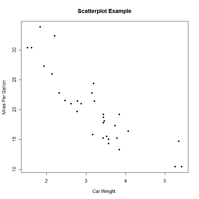
# 単純な散布図

				attach(mtcars)

				plot(wt, mpg, main="Scatterplot Example",

  				xlab="Car Weight ", ylab="Miles Per Gallon ", pch=19)
 click to view
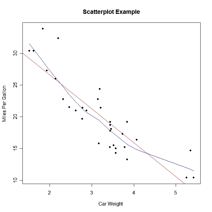
# フィットライン追加

						# lowessとはLocally-Weighted-Regression Scatter-Plot Smoothingの略だそうだ。知らないことが多いものだ。

						# Cleveland, W. S. (1979) Robust locally weighted regression and smoothing scatterplots. J. Amer. Statist. Assoc. 74, 829-836.


					abline(lm(mpg~wt), col="red") # regression line (y~x)

					lines(lowess(wt,mpg), col="blue") # lowess line (x,y)
 click to view
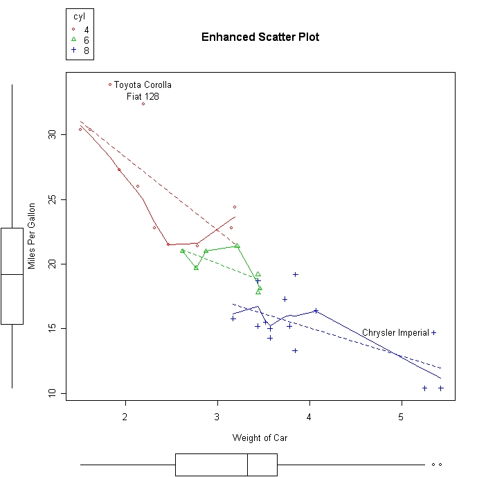
car パッケージのscatterplot( ) 関数にはいろいろオプションがある (あてはめ線、箱ヒゲ図、要因ごとのプロット、交点の図示など) 。
# mpgとweightの散布図をcylinderごとにプロット

					library(car)


					scatterplot(mpg ~ wt | cyl, data=mtcars,

					  xlab="Weight of Car", ylab="Miles Per Gallon",

					   main="Enhanced Scatter Plot",

					   labels=row.names(mtcars))
 click to view
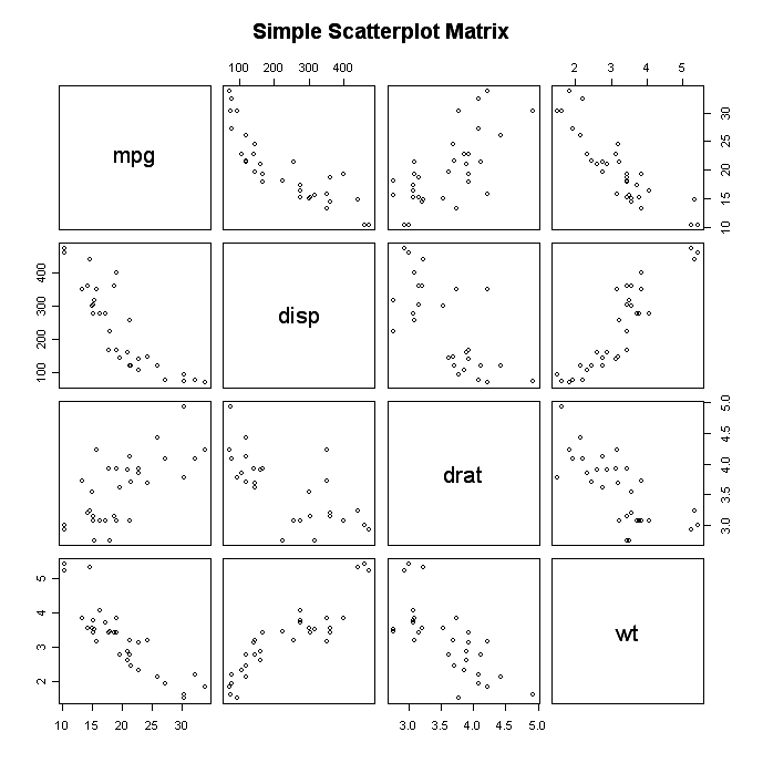
散布図行列
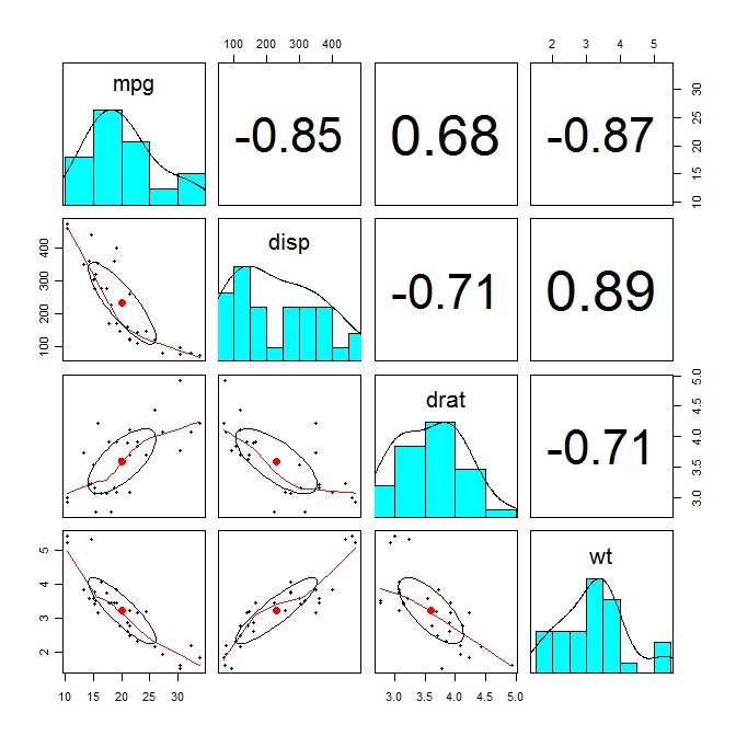
# 基本的な散布図行列

					 pairs(~mpg+disp+drat+wt,data=mtcars,

					   main="Simple Scatterplot Matrix")


					# 以下でも同じ

					pairs(mtcars[c("mpg", "disp", "drat", "wt")])
 click to view
グループごとの散布図:stripchart関数
# 基本例
xx <- data.frame(matrix(1:12, 4))
library(reshape) # reshapeパッケージのmelt関数で因子変数1列、数値変数1列のデータフレームにする
mxx <- melt(xx)
plot(mxx)
stripchart(mxx$value~mxx$variable, vertical=T, pch=1)
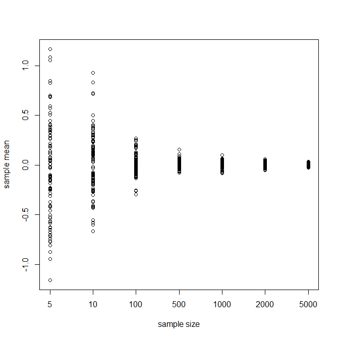
# サンプル数を増やすと誤差が少なくなって母数に近づく例
pop <- rnorm(100000, m=0) # 母平均0の母集団
ssz <- c(5,10, 100, 500, 1000, 2000, 5000) # サンプルサイズ指定
mat <- data.frame()
# サンプリング
for (ii in 1:length(ssz)) {
smpv <- vector()
for (i in 1:100) {
smpm <- mean(sample(pop, ssz[ii], replace=T))
smpv[i] <- smpm
}
mat <- rbind(mat, smpv)
}
# データフレーム整形
dat <- data.frame(t(mat))
colnames(dat) <- as.character(ssz)
rownames(dat) <- NULL
library(reshape)
mdat <- melt(dat)
# 作図
stripchart(mdat$value~mdat$variable, vertical=T, pch=1, xlab="sample size", ylab="sample mean")
 click to view
psychパッケージのpairs.panesls関数
# 相関の高さごとに文字の大きさが変わったりする。

					library(psych)

					pairs.panels(mtcars[c("mpg", "disp", "drat", "wt")])
 click to view
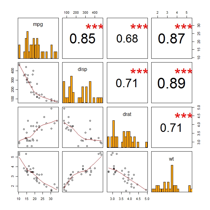
panel.cor関数をpairs関数の中で使う。
# 相関の高さごとに文字の大きさが変わり、アスタリスクもつく。R Graph Galleryの該当記事より。マジお勧め。psychパッケージに同じ関数があるのでpanel.cor2にした。。元々はpsychパッケージからきたのかも。
panel.cor2 <- function(x, y, digits=2, prefix="", cex.cor) {
{
usr <- par("usr"); on.exit(par(usr))
par(usr = c(0, 1, 0, 1))
r <- abs(cor(x, y))
txt <- format(c(r, 0.123456789), digits=digits)[1]
txt <- paste(prefix, txt, sep="")
if(missing(cex.cor)) cex <- 0.8/strwidth(txt)
test <- cor.test(x,y)
# borrowed from printCoefmat
Signif <- symnum(test$p.value, corr = FALSE, na = FALSE,
cutpoints = c(0, 0.001, 0.01, 0.05, 0.1, 1),
symbols = c("***", "**", "*", ".", " "))
text(0.5, 0.5, txt, cex = cex * r)
text(.8, .8, Signif, cex=cex, col=2)}}
x <- mtcars[c("mpg", "disp", "drat", "wt")]
pairs(x, lower.panel=panel.smooth, upper.panel=panel.cor2)
library(psych)
win.graph()
pairs(x, lower.panel=panel.smooth, upper.panel=panel.cor)
# これをもとにpairs2をつくった
pairs2 <- function(xx, ...) {
require(psych)
pairs(xx,
diag.panel = panel.hist,
lower.panel=panel.smooth,
upper.panel=panel.cor2,
cex.labels = 1.5, ...)
}
pairs2(x)
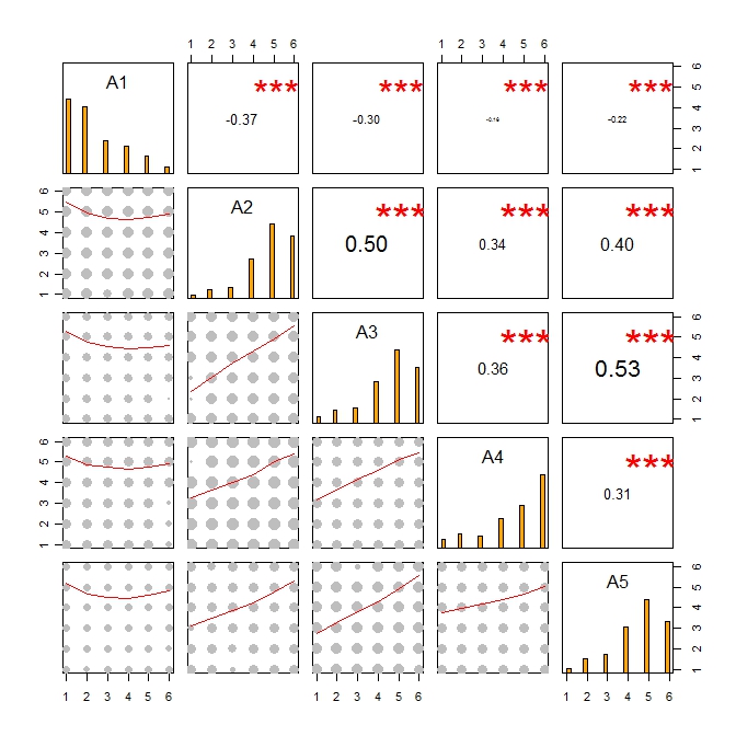
# カテゴリカルデータ用にしたpairs.ordered.categorical関数。spearmanの順位相関をもとにしている点に注意。こちらの記事より。こちらも参考。
# 上記サイトより関数コードを読みこむ。
source("pairs.ordered.categorical.r")
library(psych)
data(bfi)
pairs.ordered.categorical(na.omit(bfi[1:5])) # 欠損値を除去しておかないと動かない。
 click to view "pairs2"
 click to view
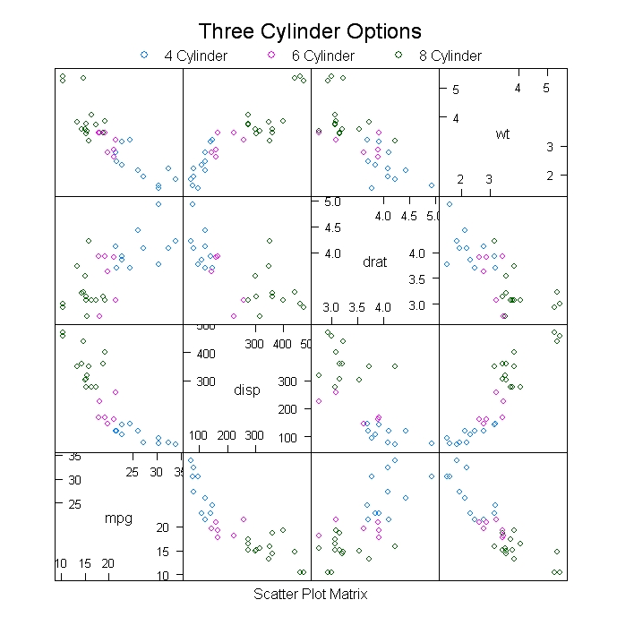
lattice パッケージのsplom関数
# 要因ごとに色分け。

				library(lattice)

					splom(mtcars[c(1,3,5,6)], groups=cyl, data=mtcars,

					  panel=panel.superpose,

					   key=list(title="Three Cylinder Options",

					   columns=3,

					   points=list(pch=super.sym$pch[1:3],

					   col=super.sym$col[1:3]),

					   text=list(c("4 Cylinder","6 Cylinder","8 Cylinder"))))
 click to view
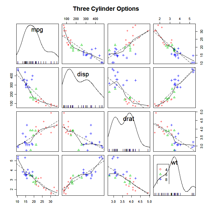
carパッケージの scatterplotMatrix 関数
# 平滑化、箱ヒゲ図、密度、ヒストグラム、主軸などいろいろ描ける。

				scatterplotMatrix(~mpg+disp+drat+wt|cyl, data=mtcars,

  				main="Three Cylinder Options")
 click to view
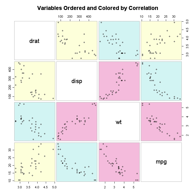
gculsパッケージ
# gculsパッケージ。相関ごとに色分け。Scatterplot Matrices from the glus Package


					library(gclus)

					dta <- mtcars[c(1,3,5,6)] # get data

					dta.r <- abs(cor(dta)) # get correlations

					dta.col <- dmat.color(dta.r) # get colors

					# 高い相関ごとに並べ替え。対角線付近に配置。

					dta.o <- order.single(dta.r)


					cpairs(dta, dta.o, panel.colors=dta.col, gap=.5,

					main="Variables Ordered and Colored by Correlation"
	)
 click to view
その他便利そうなもの
- chart.Correlation ヒストグラムつき。
- hydropairs: ヒストグラムつき2。
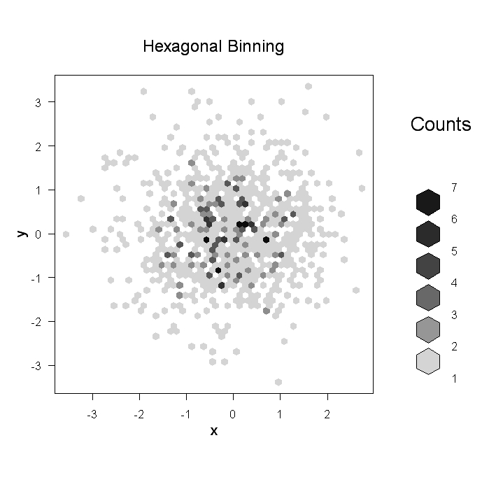
高密度の散布図
データポイントがたくさんあってその重複に意味があるときは散布図は不便。そんなときはhexbin パッケージのhexbin(x, y) 関数を使うと六角形 (hexagonal )のポイントで2変数間の関係を表現できる。
# High Density Scatterplot with Binning

				library(hexbin)

				x <- rnorm(1000)

					y <- rnorm(1000)

					bin<-hexbin(x, y, xbins=50)


				plot(bin, main="Hexagonal Binning")
 click to view
あるいはsunflowerplot 関数を使う。重なるデータに応じて花弁が描かれる。
sunflowerplot(iris[, 3:4])
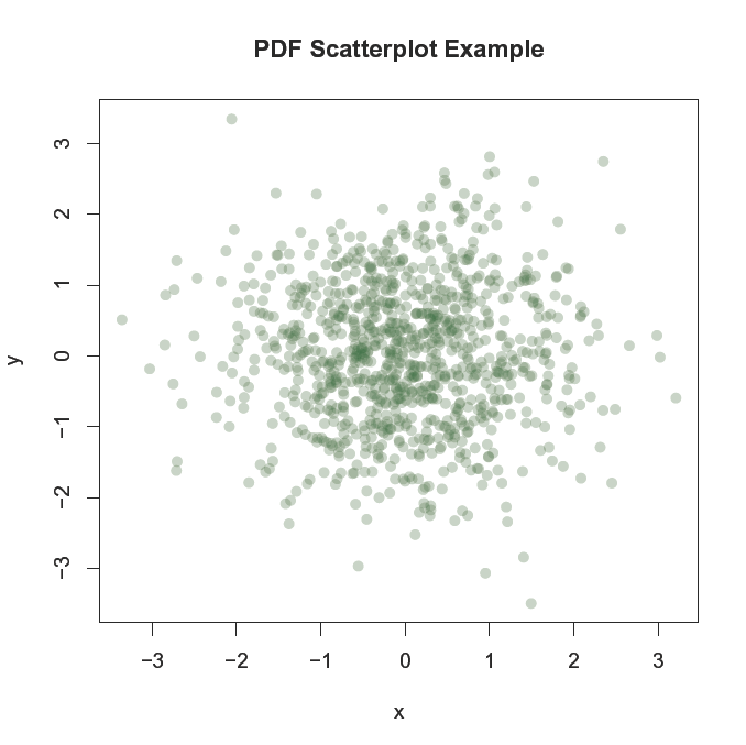
ポイントの重複が見える透明なpdfファイルを保存できる。
				pdf("c:/scatterplot.pdf")


				x <- rnorm(1000)

					y <- rnorm(1000)


				plot(x,y, main="PDF Scatterplot Example", col=rgb(0,100,0,50,maxColorValue=255), pch=16)

				dev.off()
 click to view
Note: col2rgb( ) 関数でRの色のRGB値がわかる。たとえば、col2rgb("darkgreen") とすると r=0, g=100, b=0 が返される。alpha=透明レベルは4番目の色ベクトルで、0は完全に透明を意味する。詳しくは help(rgb) 参照。
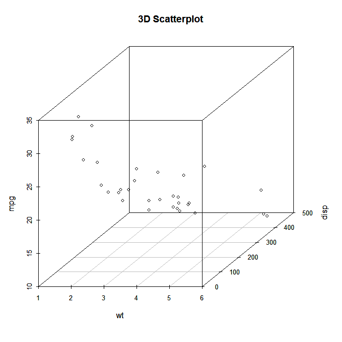
3次元散布図
scatterplot3d パッケージで3次元散布図が作成できる。
				library(scatterplot3d)

				attach(mtcars)

				scatterplot3d(wt,disp,mpg, main="3D Scatterplot")
 click to view
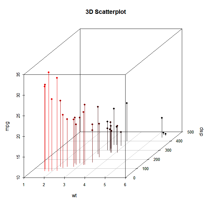
# 3次元散布図に垂線を下ろす。

library(scatterplot3d)

attach(mtcars)

scatterplot3d(wt,disp,mpg, pch=16, highlight.3d=TRUE,

  type="h", main="3D Scatterplot")
 click to view
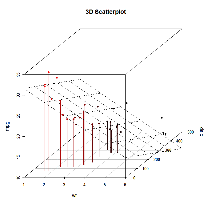
# 色つき垂線と回帰平面

				library(scatterplot3d)

				attach(mtcars)

				s3d <-scatterplot3d(wt,disp,mpg, pch=16, highlight.3d=TRUE,

				  type="h", main="3D Scatterplot")

				fit <- lm(mpg ~ wt+disp)

				s3d$plane3d(fit)
 click to view
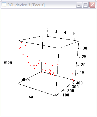
マウスでグリグリ動かす
rgl パッケージのplot3D(x, y, z) 関数を使う。
				library(rgl)

				attach(mtcars)

				plot3d(wt, disp, mpg, col="red", size=3)
 click to view
Rコマンダー のscatter3d(x, y, z) 関数でも似たようなことができる。
					library(Rcmdr)

		attach(mtcars)

					scatter3d(wt, disp, mpg)
 click to view