ヒストグラムと密度プロット
ヒストグラム
hist(x) 関数でヒストグラムが書ける。x には数値ベクトルを与える。 freq=FALSE とオプションを指定すると、頻度の代わりに確率密度をプロットする。 breaks= のオプションで階級の数を指定できる。幅は より上〜以下 になる。以上〜未満にするにはrigth=FALSEとする。
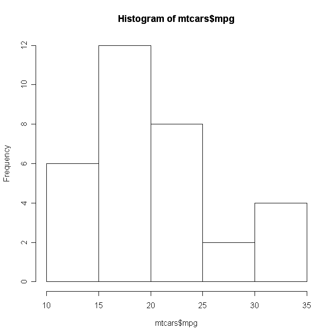
# シンプルなヒストグラム

				hist(mtcars$mpg)
 click to view
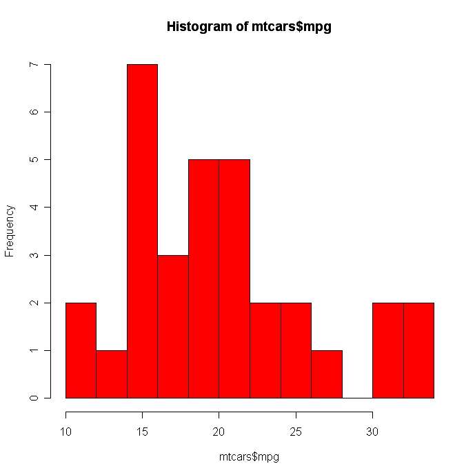
# 区分を細かくして色をつけた。

  hist(mtcars$mpg, breaks=12, col="red")
 click to view
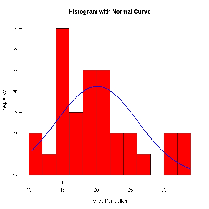
# 正規曲線をつけた (Thanks to Peter Dalgaard)

				x <- mtcars$mpg

				h<-hist(x, breaks=10, col="red", xlab="Miles Per Gallon",

  		main="Histogram with Normal Curve")

xfit<-seq(min(x),max(x),length=40)

yfit<-dnorm(xfit,mean=mean(x),sd=sd(x))

yfit <- yfit*diff(h$mids[1:2])*length(x)


lines(xfit, yfit, col="blue", lwd=2)
 click to view
ヒストグラムは分布の形状を示すのにいい方法とはいえない。階級をどう区切るかに左右されるので。
Excelのfrequency関数も便利である (Rとは関係ない) 。
カーネル型密度プロット
カーネル型密度関数はある変数の分布を概観するに適切でよく用いられる。plot(density(x)) で、 x には数値ベクトルを与える。
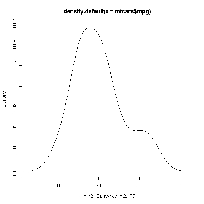
# カーネル型密度プロット

					d <- density(mtcars$mpg) # returns the density data

					plot(d)
 click to view
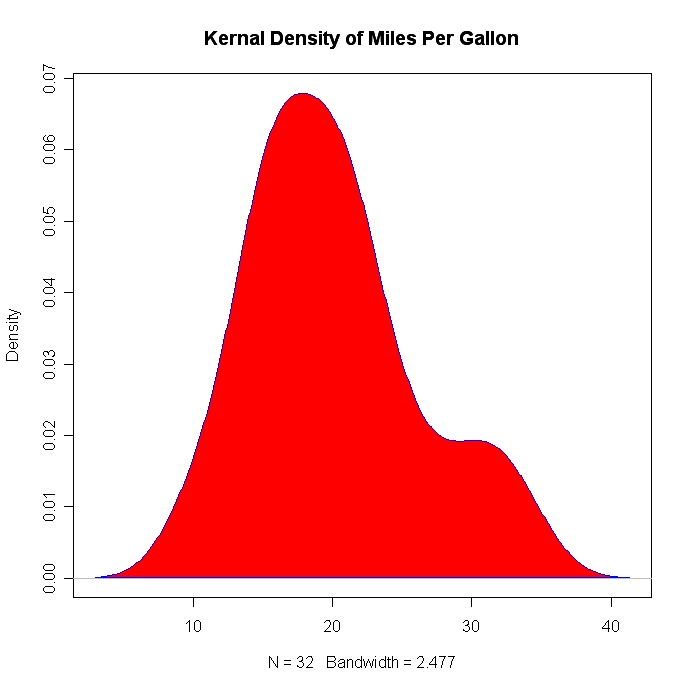
# 密度プロットを塗りつぶす

					d <- density(mtcars$mpg)

					plot(d, main="Kernel Density of Miles Per Gallon")

					polygon(d, col="red", border="blue")
 click to view
グループごとに密度プロットを比較する
sm パッケージのsm.density.compare( ) 関数を使えば、複数の密度プロットを重ね合わせることができる。使い方は以下のとおり。sm.density.compare(x, factor) 。 x には数値ベクトルを与え、 factor にはグループ化変数を与える。
# シリンダー数 (4, 6, 8) で車を群わけし、その群ごとの燃費 (mile per gallon: mpg) の密度を比較

				library(sm)

				attach(mtcars)


				# 値ラベルをつくる

				cyl.f <- factor(cyl, levels= c(4,6,8),

				  labels = c("4 cylinder", "6 cylinder", "8 cylinder"))


				# 密度プロット

				sm.density.compare(mpg, cyl, xlab="Miles Per Gallon")

				title(main="MPG Distribution by Car Cylinders")


				# マウスクリックで凡例を追加

				colfill<-c(2:(2+length(levels(cyl.f))))

				legend(locator(1), levels(cyl.f), fill=colfill)
 click to view